
Cabin design is quite important in the aviation industry as it is a point of differentiation from your competitors. Regular passengers will experience a familiar feeling if an airlines cabins are similar across the fleet. An easy way to do this is through bulkhead art.
Some airlines may contract a professional design firm to do their cabins while others might have the CEO’s wife give it a shot. Either way it is quite interesting to see, so let’s have a look.
How About A Map?
In the 1950s on the Constellation, maps were the in thing. TWA featured a map on the wall of a compartment and Qantas did the same thing, which you can see below.
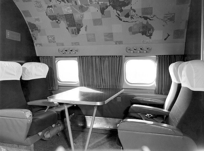
Inflight entertainment at the time consisted of cards, games and socialising so I am sure the map was a bit of a talking point. The large crab is pretty easy to notice.
Old Fashioned Scenes
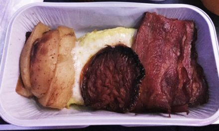
When the Vickers VC10 was introduced in the 1960s, the bulkhead in each cabin had scenes of 16th Century London on them. Unfortunately the only picture I could find online has a crew members head covering most of it.
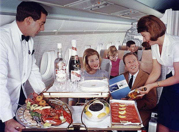
It does look pretty cool, though of course anyone’s attention is probably on the lobster, caviar and the gigantic bottles of booze they’re serving up! There is some concept art for the VC10 cabin too.
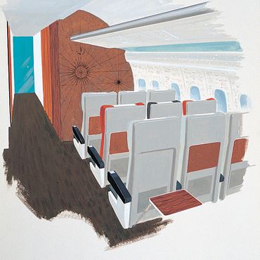
This comes from the Robin and Lucienne Day foundation and I am not sure if it progressed past the concept stage. I wonder if anyone out there knows.
Now For The 1970s!
British Airways managed to keep things tasteful enough in the seventies. On the bulkhead is a stylised world map in first class on the Super VC10 which is rather colourful.
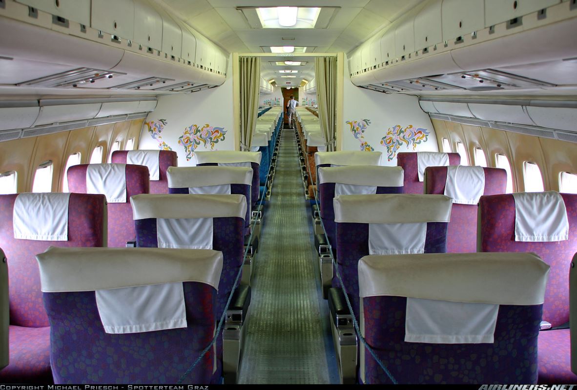
Economy class passengers received a different design, just as colourful, but of what appears to be a city of some kind. It looks quite nice I think.

Happily the aircraft in the pictures is preserved at Duxford. I recently visited and had hoped to get some closer pictures but the aircraft was closed. This one is an East African Super VC10.

It looks pretty busy. I understand it is in a gold or yellow colour so it would have been striking to say the least!
Pan American 1970s Bulkhead Art
Pan Am were no strangers to some bulkhead art either. All their aircraft were named Clipper something to hark back to a time when Clipper ships sailed the oceans. That is why you get something like this in a Boeing 707.
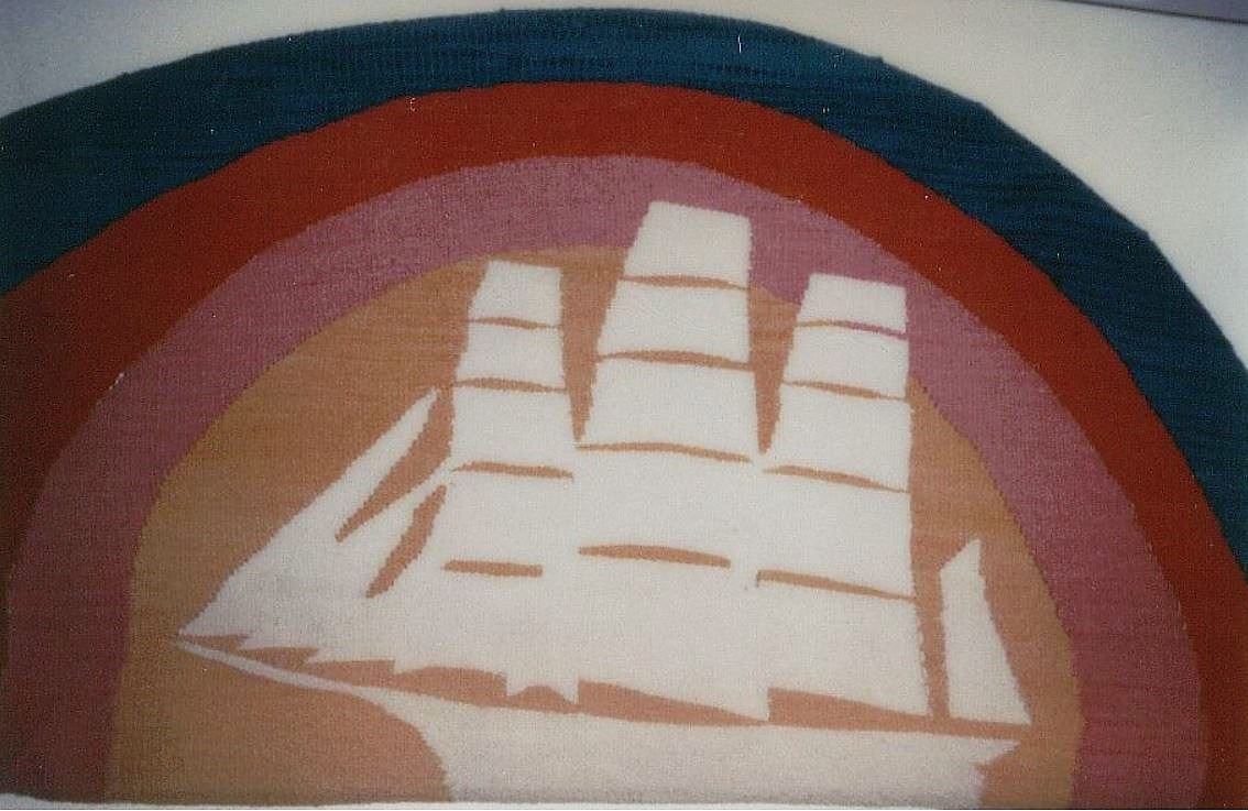
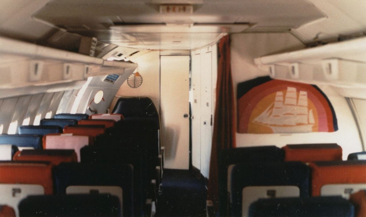
These appear to be tapestries of some kind and the theme continues with one like the below, evoking a feeling of sailing the seven seas, also from a Boeing 707.
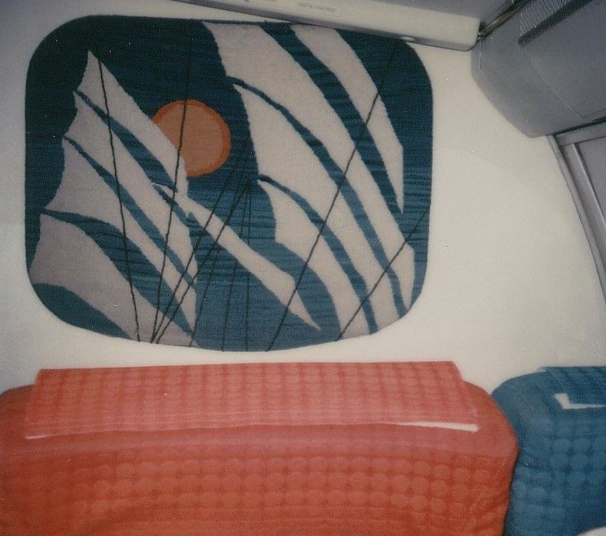
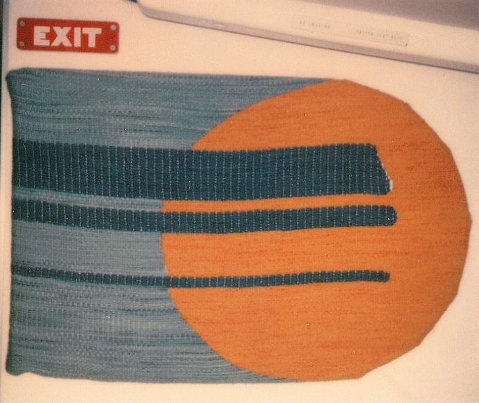
Next is from another Boeing 707 and I think this is supposed to be the sun and the sky. That is my interpretation anyway, always happy to be corrected.
Just in case you were wondering, they do kind of work in context of the rest of the cabin. Here is the first image in the actual cabin so you can see it to its full effect.
I think the conclusion here is that tastes were a little different back in the 1970s!
Picture, Picture On The Wall
My first experiences with cabin art are the pictures that British Airways used to have on their bulkhead at the front of the cabin. Here’s one I photographed.

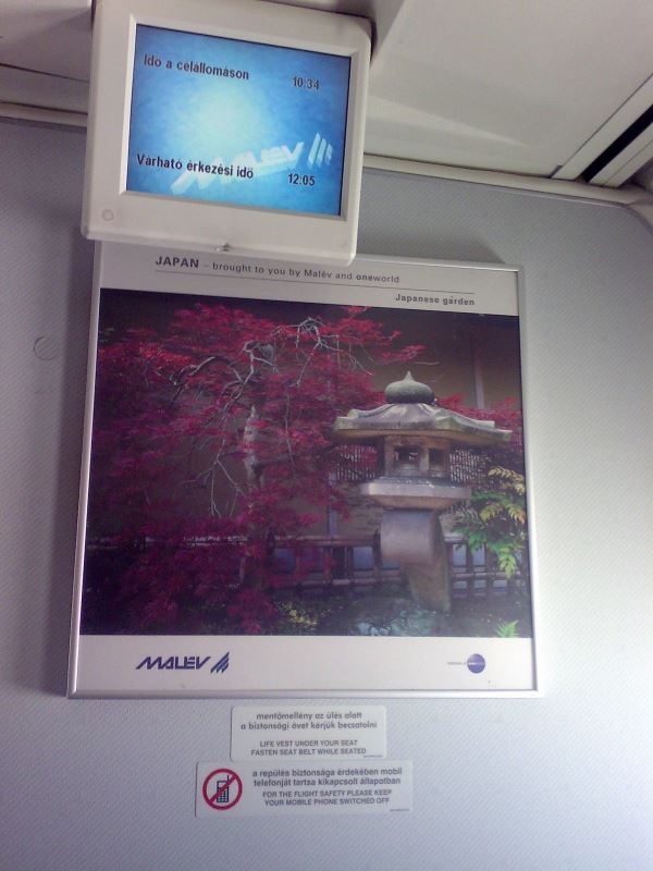
On the other hand, defunct Hungarian carrier Malev used the opportunity to put up advertising. Not the greatest choice, but somewhat understandable.
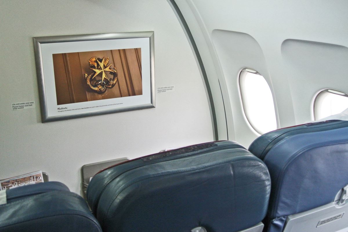
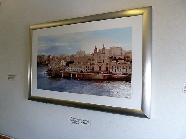
Air Malta are doing things right, with pictures and scenes of their country on the bulkhead. I think these two look rather nice.
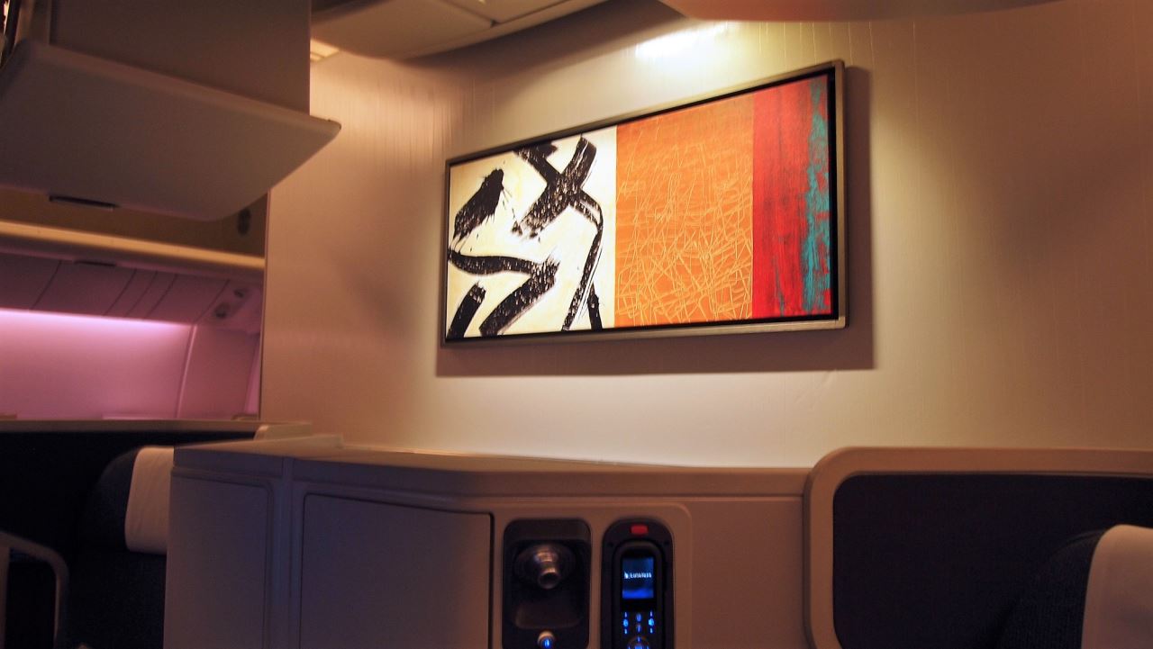
Hitting it out of the park though are Cathay Pacific. This art on the Boeing 777-300ER in Business Class evokes both their origin and a high end apartment in Hong Kong. I really like it.
A variety of similar pictures is a good thing as there is something new to see each time you fly. Many airlines don’t do it, and I think they should.
A Coat Of Arms And A Special
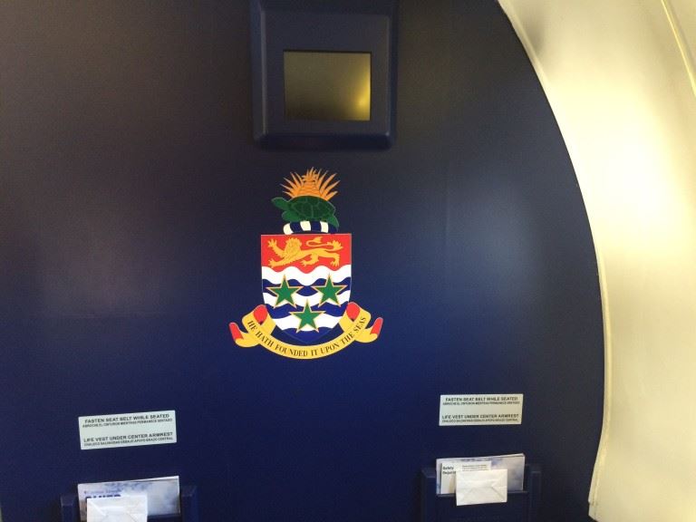
Cayman Airlines have the coat of arms of the country on their bulkhead. Something different and it looks pretty sweet.
Brussels Airlines had a Tin Tin themed aircraft and naturally there is artwork inside the aeroplane as well. It is very colourful indeed.
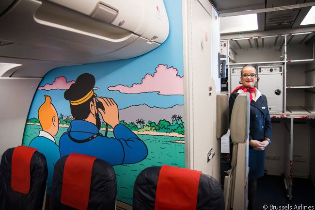
You can be sure the kids would have loved that one!
It The Ubiquitous Airline Logo
Airline logos can look quite classy on a bulkhead if done right. Most airlines do it right, but it isn’t all that creative, is it? It does reinforce the brand image so it makes sense when they do it.
-

- Aer Lingus
-
- Qatar Airways
Sometimes they are back lit to add to the mood and sometimes they are just stuck on the wall. I guess it shows who has money and who doesn’t when it comes to the airline in question.
-
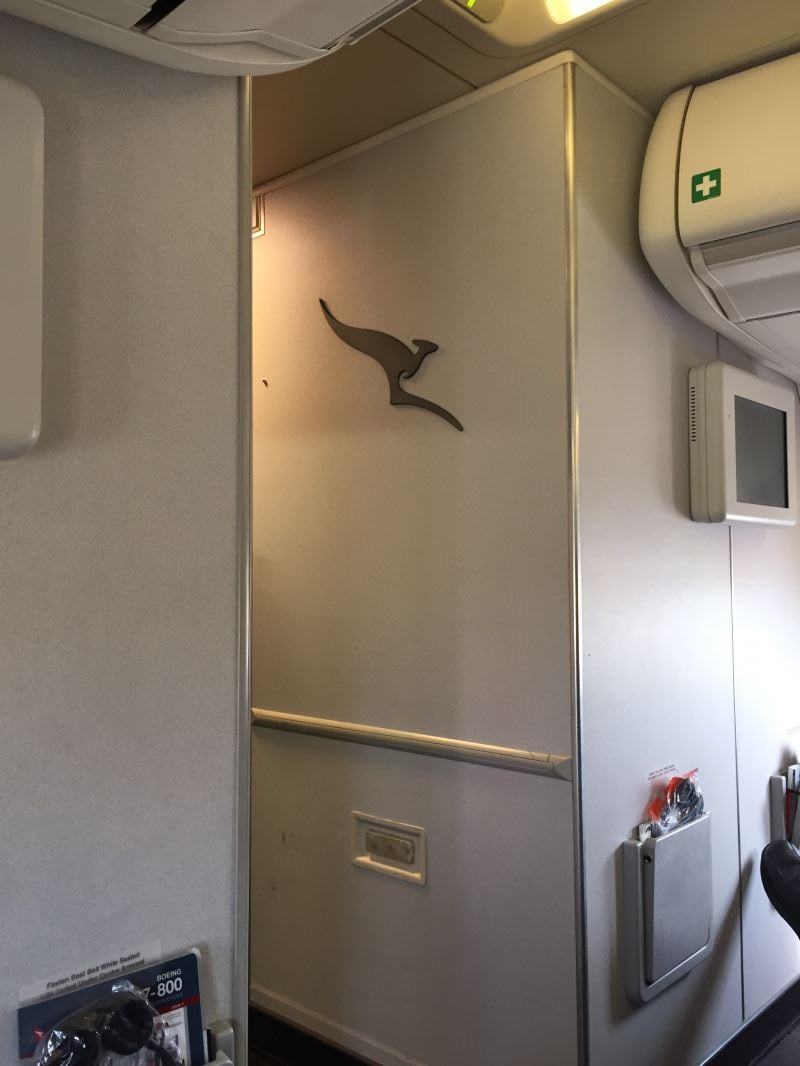
- Qantas
-
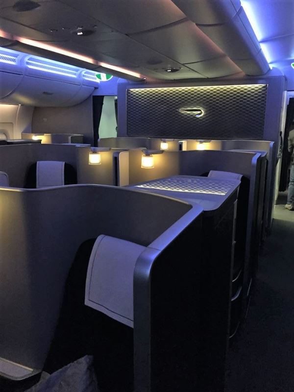
- British Airways
I jest, money has nothing to do with it. Usually international aircraft have a nicer design than their domestic counterparts the world over, so that is the real reason why.
Is This The Bulkhead To Beat?
Perhaps the most unusual one of all is the one fitted to Concorde. British Airways did this best with their Marilake displays on each forward bulkhead showing the speed, outside temperature and what not.

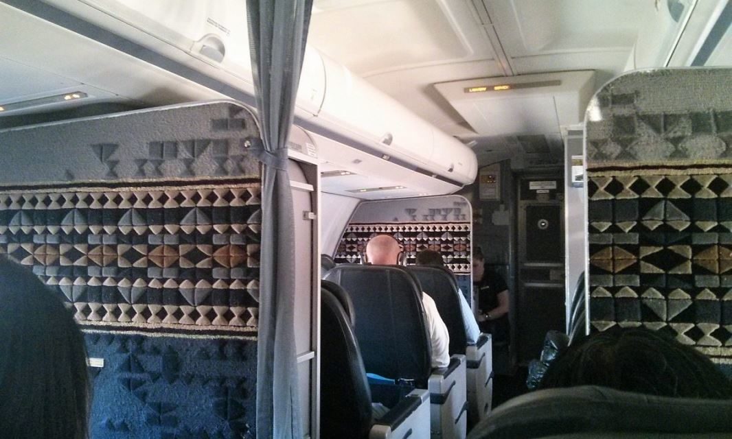
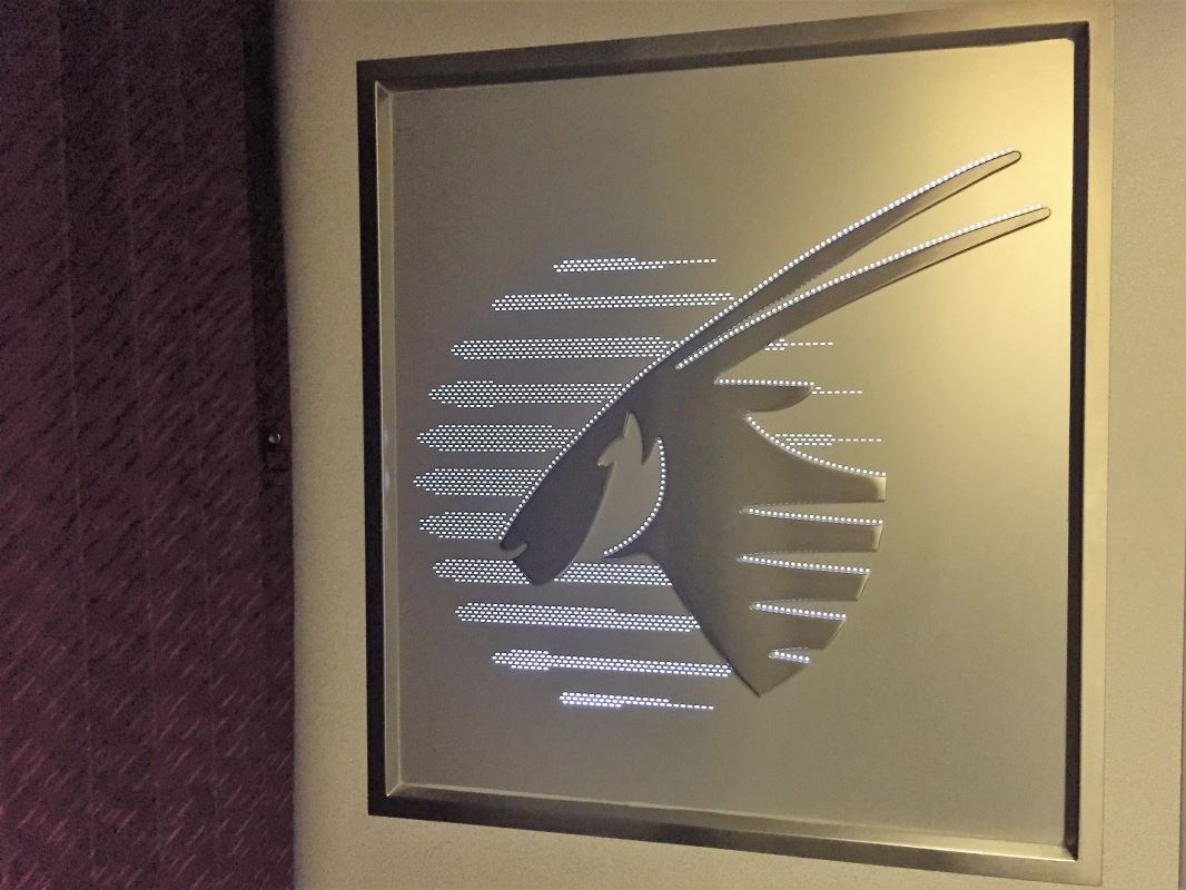
That would have been fun to experience. Last one is the same airline as the featured image which is Alaska Airlines. I really like the pattern and design to reflect native Alaskan clothing and art.
When I flew first class on Alaska I thought it was really cool and have liked it ever since.
Overall Thoughts
I hope you’ve enjoyed this little journey through the ages when it comes to airline cabin design and bulkhead art. I find it fascinating as it can be so very different from airline to airline.
What do you think of these? Any that I’ve missed that I should see? Have you flown with any of the above? I’d love to hear what you think. Thank you for reading and if you have any comments or questions, please leave them below.
To never miss a post, you can follow me on Facebook, and I am on Twitter and Instagram too!
All my flight and lounge reviews are indexed here if you want to see more.
Featured image by LAX2CGKx5 via Twitter.
Qantas Constellation map from Pinterest.
BOAC VC10 Cabin with food from Pinterest.
1970s VC10 Cabin by Michael Priesch and Jid Webb via Airliners.net.
Pan Am Boeing 707 images by EverythingPanAm.com.
Air Malta Maltese Cross image by Patrick Smith of Ask The Pilot
Air Malta city image by KnightofMalta.
Cathay Pacific Business Class image by Jonny Clark of The Design Air.
Cayman Airlines Coat of Arms by Jason Around The World.
Brussels Airlines Tin Tin from Airlines and Destinations.
Concorde Marilake Displays by Joe Corrigan via Airliners.net.
Final Alaska image by SFO777 via FlyerTalk.


Hi Commenting on “These appear to be tapestries of some kind and the theme continues with one like the below, evoking a feeling of sailing the seven seas, also from a Boeing 707” YES!, These bulkhead artworks were real hand woven tapestries, made of fireproofed wool for safety standard. These tapestries were made by hand-weavers in New York City at the Studio of the American Artist Michelle Lester (1940-2000). Ms. Lester delivered several hundreds of these artwork, ordered by Pan American World Airways. François in NYV, May 28, 2021.
Thank you so much for that information, that is really wonderful to know the person behind the designs. I had no idea who made them and for the extra details there. Really appreciate you taking the time out to tell me that! Much appreciated!
Not much beats this bulkhead on a Canadian North 737-200 Combi.

Whoa, now that is some bulkhead art! Absolutely brilliant! Thanks for sharing that. They don’t do things by halves in Canada, that’s for sure!